Is your business logo memorable? Will people remember your company from it? No? Well then read on. The below are things to think about when designing a logo:
Be different
Stand out from the crowd, your logo must be memorable! Once people can’t see any of your branding, they must still be able to remember it. Think about Apple, that logo is instantly recognisable and easily memorable with its simplicity and ease of use.

Understand your brand
A logo isn’t just an image! It’s an intro to your brand. Think about what you want your brand to represent and what your ideology might be and build a logo around that. For example, Wikipedia’s logo is an incomplete globe of knowledge as the platform is constantly adding information and so is never ‘complete’.

Colour is important
When designing a logo think about the combination of colours you use. Different colours can mean different things and lead to different thoughts, for example red can be thought of as energetic, whereas white might be seen as clean. What do you want your logo to represent and how do the colours match up with the brand?
Get the correct name
A logo has 2 parts, a name and a symbol (generally) before a company can represent itself with just a symbol or just wording a large amount marketing and brand building must be done successfully. There are however, a few extremely well-known companies that just use wording as their logo, for instance Next and Asos. But these are companies that are usually extremely well known in their space to their potential customers.

Flexibility
Create a logo that can be used in a range of ways and on a range of marketing materials but also isn’t so complex that someone looking at the logo doesn’t have to sit and stare for five minutes to try and work out what it is. For example, Amazon uses just its name, but an arrow from A-Z indicates its wide variety of products.

Be patient
Logos don’t become iconic overnight, pick something that considers all of the above categories and then ultimately deliver the products and services you need to deliver at a high standard and over time your logo and your brand will become memorable.
Use online competitor research
This might sound sneaky but take a look online look at all the other logos out there and take inspiration from them. Look at what they do well and what you think doesn’t work so well applying this to your logo design. However, make sure you don’t break the law or anyone's copyright protection. Just use them for inspiration.
Below are some really interesting logos with little intricacies that may get you thinking:
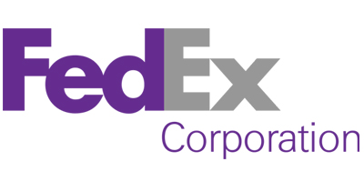
FedEx

Have you spotted it?.................. Spotted what you might be thinking. FedEx has been extremely clever with their logo design. This world-wide delivery company has inserted an arrow into the logo. Spotted it yet? If you look between the E and the X you will see an arrow which represents direction, speed and precision perfect connotations for a delivery company.
Adidas

Adidas has built a logo that has and will continue to last the test of time! The three stripes have become renowned on all things Adidas. Whether its footwear, clothing or sporting equipment if you see a product with three stripes on you immediately know that its Adidas.
Henderson Global Investors/Janus Henderson Investors


Henderson Global Investors is a global asset manager. However, they were having trouble selling into the USA. Having done some research they discovered that their logo icon reminded people of a Hurricane something that the southern states of America must deal with every year. Not necessarily representing safe money management or anything positive! This led them to change their logo (after merging with another asset manager) into a far cleaner crisp premium style logo to represent quality, knowledge (their strapline is Knowledge.Shared) and safe money management.
Got a business question?
We're here to help. Get in touch.
Book your free appointment below:
